Lemonade from Lemons: Photoshop Help for Low Light Photos

Maki, over at I was just really very hungry posted her tips for taking better photos in restaurants and indoor markets, including the golden rule (never use your built in flash!) as well as some neat ideas to use those white napkins for something other than wiping off your face. Even if you do everything right taking those photos, low light conditions usually mean extra work in Photoshop. You’ll likely end up with several typical problems:
- Photos that are just too dark
- Photos with a yellow/green cast
- Graininess, color loss or noise due to high ISO speeds (400+)
- Blurred photos due to your hands shaking while trying to hold a long exposure
Sometimes you’ll end up with just one, sometimes you’ll get them in combination. The good news is that you can fix a lot of these problems. The bad news is that you may have to alter your view of what a “good” photo is.
I’ve been meaning to get around to writing a post on a correct photo versus a great photo for some number of weeks now. This isn’t that post… but I will spill the beans a bit and mention that a great photo isn’t necessarily one that demonstrates the best photographic technique. In fact, those “correct” photos are very often cold and lifeless. Spend some time flipping through lifestyle or food magazines. They will be packed with photos that are over exposed, under-exposed, have motion blur, are over saturated or under-saturated, have colors pushed this way or that. The difference between those photos and a bad photo often comes down to intent. An overexposed photo that you meant to be properly exposed is bad; if you wanted some blow out, then it may (or perhaps may not) be a good one… whether or not you intended the blown out section at the time of the shot or you “found” it during editing.
So with that in mind, all those photos that have come off of your camera with problems aren’t necessarily headed for the trash bin. More than likely, a large percentage of them can be saved. Case in point is my last plating and presentation class where most of my photos were pretty horrible straight off the camera, and it was going to take more than a simple auto-correct exposure to get something I liked.
The first two problems I listed, the photos are too dark or have a color cast, are the easiest to fix with some adjustments to color balance and exposure. However, you still may not be happy with the photo… it will likely exhibit signs of the third problem… it will be too grainy/noisy or have a general loss of color.
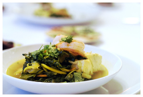
Take this photo, for example:
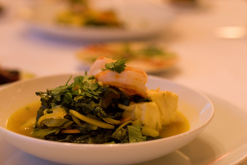
This was shot hand-held inside with some kitchen lighting with my 50mm lens. I had my ISO tweaked to 1600 and shot with a very narrow depth of field, just 2.8. The exposure was still 1/50… just barely enough for me to hand hold… and I did in fact get a pretty sharp shot. But it has a serious color cast to it. The bowl and table cloth should be white, not a dingy beige. Because I’m shooting Raw, I can adjust the white point of the photo in Adobe Raw as I open it. By setting the white point to 2800, the bowl becomes white again:
But, I’m still not particularly happy with the way the photo looks. Now that the bowl is white, the shadow beneath the bowl has gone a very bright blue. Actually, if you look in the first photo, it’s blue there as well, but it’s a bit less noticeable. This is a tough one to fix. In fact, I spent quite a bit of time in Photoshop trying to adjust the color balance of just the shadows to improve it, with no real success. Now I’m sure that there is probably some way with a combination of curves and channels that I could just adjust that color, and desaturate the shadows to get a happy grey… but I decided that if I’ve got bright blue shadows, I’m part of the way there to a cool cross-processed photo.
Cross processing is really a film term. Technically, you can’t have digital cross processing because it’s a chemical technique of developing one type of film as if it were another… for example, if you shoot color negative film (ie, normal film) and process it with E-6 (color reversal) film or C41 (print films) chemicals. Different films will react differently, but what you’ll end up with are unexpected colors, saturation and exposure… often making for truly striking photos and sometimes absolutely terrible ones. Shooting digital means you have to approximate the look… typically starting with adjusting the white point as I had already done.
In full Photoshop now with my oddly-colored, slightly dull photo, I start playing with the layer blending. To do this simply select your base layer and choose Duplicate Layer from the layer menu (or the context menu). Give your layer a name, and ok through the dialog. Select your new layer. In the layers palette, there is a drop down that says Normal. Here’s where you can start to play. I like to work my way through each of the blending modes to see what works for that particular photo. Most of them are going to look really bad right out of the gate though, so I like to start by moving the opacity slider down to about 50%. This tones down the effect in a big way.
For this photo, I loved the look of the color dodge blending mode, with opacity way down to about 35%. Color dodge brightens the colors of the layer but leaves the blacks alone, and then blends the new colors with the old layer. The result was a brighter overall photo and some interesting bumps in the saturation of the photo. Color burn is similar, but in addition to brightening the light colors, it darkens the dark colors.
Now, the photo is starting to look like something I like. It’s not exactly real looking, but then, I accepted that when I gave up trying to remove the blue shadows. However, there are still problems… it’s still not looking quite how I want it. The vegetables in the dish look great, but the yellows on the scallop are just too overpowering and there’s a bit of a pink cast to the white table cloth. Plus, while it’s brighter, but not quite bright enough in the right places. It still needs an exposure adjustment, so I do my usual.
Then, onto the color. Typically, I use a Color Balance layer. But given the yellows and blues I already have in this photo, I decide that a saturation change would be better here. The simplest way to do this is by creating a Hue/Saturation adjustment layer, and just nudging down the saturation some. But, I decided to get a bit fancier.I start by creating yet another duplicate of that original layer, and stick that into a layer group (you create those with the little folder icon). Then, selecting the new duplicate layer, I create a saturation adjustment and turn the saturation down to about -70. The photo should look pretty grey at this point. Then, I select the layer group icon, and change the blending mode to Saturation. This mode uses the saturation of the selected layer but the luminance and hue of the lower layer. Then, I set the opacity of that layer to 30%. And with that change, the bright blues and yellows are still there, but not quite as vivid. Now, the difference between this change and the simple saturation slider is pretty sublte… and it’s a lot more work to do it this way… but it also gives you more control over fine tuning the exact look you want to get. I won’t do this for a lot of photos, but if I’m salvaging five or six out of a batch, it’s worth it to me to get the little bit of extra flexibility.
So the result of all this work? Well, the finished photo (best viewed in Safari) has highlights blow out all over the place, lots of grainy noise and brilliant blue shadows, but it’s quite a good stylized photo. Perhaps not quite out of the pages of Food & Wine, but I can still picture some text gracefully flowing over the right upper corner…
If you are still reading, Wow! You’ve got stamina. I’ll briefly try to cover what to do with the final case… blurry photos. The short answer is that you can’t really unblur a blurry photo. Your only choice to save a photo like this is to simply go with the blur. Make it more extreme. Make it look intentional.
This photo isn’t really all that blurry, so I’ll get it a bit of a blur to begin with. To create the effect, start by ignoring the blur and doing the basic white point, exposure and color adjustments. Take these a bit more extreme than you might normally… you can blow out the whites and the shadows a bit.Now, duplicate your base layer, select it, and apply a very extreme motion blur (in the Filters menu under Blur). I like to adjust the angle to about 45 degrees and the radius to about 180. Then, set the opacity on the layer to about 50%. You should get a look with lots of energy that looks like you meant it that way…parts of the underlying photo will show through and probably look more in focus, simply by contrast, and you should get some streaks of color running diagonally through the photo. Of course, this works best if there was potential for movement anyway… things like wine glasses clinking, pots shaking, or even forks moving the food to your mouth.
These are just two examples of “saving” photos that didn’t turn out as well as you might of hoped. Of course, getting a good crisp intentionally exposed photo from the start by using some of Maki’s tips will save you time… but when things don’t quite go your way, you still have options.
Technorati Tags: Food, Food Styling, Photography, Photoshop, Tips
If you wanted to, removing the blue shadow would be easy – using Hue/Saturation. By reducing the saturation of just the blue (and you can adjust the range affected in the range bar).
Since there isn’t any blue in the food in this shot, you can reduce the saturation to whatever degree you like and it won’t affect the color in the rest of the photo.
You could even use do this on an adjustment layer and use your layer blending trick for more effects. (I’ll have to try that trick myself.)
Hi Paul,
Thanks for the tip. I did try that, but it left weird green and purple halos when I removed the blues and cyans… and even with setting them all the way down to 0 sat, there was still a hint of blue. I’m sure that I could have manually sponged out the blue to make that better… but that takes a ton of time and dexterity.
That said, I’m sure that will work very well on other photos!
-L
Well written tutorial on Photoshop. That app has boundless possibilities along with the ability to confuse even the best astro-physist. Once again, you have lit the pilot light on my photo love.
Thank you, thank you, thank you. A million times, thanks.
Hi Jack! Yes, Photoshop is immense. I’m always finding new tricks.
Christine! You are more than welcome!
This site just what i want… i vaguely gone through it.. i am gonna be a regular reader… you can check out http://www.nandyala.mahanandi.com for awsome food photography!!
Thanks a ton for all inputs about photography!
Hey you are included in my Blogroll..is tht ok with ya?
I agree with everyone above – excellently written tutorial. I love the mantra of taking sub-par photos to the extreme – generally taking the adjustments to the absolute limit.
That’s what I love about photoshop – the vast range of possibilities and combinations…
Thanks again!
Aparna- of course! Thanks!
Gilly – thanks!
Hi there. Im very thankful for your tips.
Im a intermediate photographer in High School right now and Im glad i found this site to learn some very helpful tips
Thanks, Eggn