Chaos and Colorspace

I spend a lot of time fine tuning my images for my blog to get them to achieve the right balance of color and light. While it’s certainly not the hours that some professionals spend, it’s still probably the most time consuming part of food blogging for me (with the exception of some of the actual cooking). I want colors that are vivid, life-like or sometimes very subtle, to fit the mood I’m trying to achieve and I’m willing to tweak and futz with them until they are, in my eyes, just perfect.
So, imagine my disappointment when I went to try out Firefox and pulled up my blog and found, instead of the beautiful rich colors I was expecting, photos that looked dull and dead.
I certainly know that getting color right is hard… different displays show colors in different ways depending on how they are calibrated… different lighting conditions in the room also play a big role… but I was looking at the same photo on the same web page on the same computer in two different browsers and getting very different results:
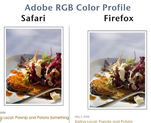
The image on the left is in Safari on the Mac, the browser I normally use as do only about 8% of my readers. The image on the right is from Firefox, which makes up about 12% of my readership.
To my biggest group, IE users, I think you are ok. I can’t exactly tell, because IE is no longer supported on the Mac… but the photos looked pretty good when I checked them on my PC.
The issue is color space. A color space is a map of colors created by different variables plotted on different axis. There are lots of different color spaces, and each one has slightly different colors as well as a different number of supported colors (this is called a gamut). Everything has a gamut… the photo itself, the display’s capabilities and even the capabilities of the software. Ideally, you want the source (the photo in this case) to have all of its colors contained in a smaller gamut than its output (the display) gamut. When they don’t, you get color loss. Of course, if the output gamut is a lot bigger than the sources gamut, then you aren’t taking advantage of all the colors that you can. It’s a balancing act. Understanding color spaces is highly scientific with a bit of voodoo on the side for kicks… I know several people that I used to work with that have pretty much devoted their lives to this art… mapping out Reds, Greens and Blues (RGB); Hue, Saturation and Luminosity (HSL); Cyan, Magenta, Yellow and Black (CMYK) and many, many others. I consider myself lucky that I am not one of them.
For my purposes, I only care about one of these… RGB. Actually, I care about only certain variations of RGB… namely sRGB and Adobe RGB. sRGB was designed in 1996 to support monitors at that time. As monitor technology has improved, the number of colors that modern displays can show has greatly increase. So today, sRGB seems very limiting. The canvas can accept a lot more colors than are on the palette. Adobe RGB was developed in 1998 so it’s a little bit newer and holds more colors, particularly in the greens and cyans. It still isn’t the best overall color space, but it’s become a standard for digital photography. (For those curious, the LAB colorspace offers twice as many colors as Adobe RGB and was designed to map out all of the colors that the human eye can see… it’s almost entirely a mathematical problem, and all representations are inherently inaccurate, but there’s lots of equation fun to be had in the Wiki post.)
What it comes down to is that neither sRGB or Adobe RGB is a perfect solution… for software that supports Adobe RGB, the images can look deeper and richer. But, the software has to support it to achieve the effect. When it doesn’t, the images actually look worse. sRGB is a baseline standard, so you can be fairly confident that if you use this color space, you now what your images will look like, even if you can’t get them as rich as you would like. Predictable or Rich. You have to pick.
Some software, like Photoshop and Safari, can understand both of these colorspaces and display the color accurately as intended… so you don’t have to choose. However, other software, like Firefox, doesn’t support Adobe RGB at all, so as in the example above, any photos saved with this color space will look washed out. Files saved with an sRGB color profile may still look a bit different from program to program, but they will come a lot closer because they map better to having “no” color information.
Here is the same photo from above saved with an sRGB color profile instead of Adobe RGB:
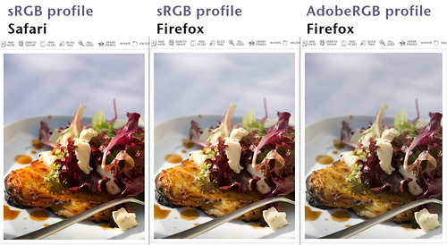
Click for a better view
The Safari version still looks good… in fact, it’s kind of hard to tell the difference. The Firefox sRGB version looks acceptable…there’s a bit more gold to the cake and a bit more red in the lettuce. It’s still not as vibrant as the Safari version, but at least it’s not as grey as the one on the far right with the Adobe RGB profile.
If you take photos in JPEG format on your camera, they will most likely be set to the sRGB color space by default. You probably won’t need to do anything to them, although it wouldn’t hurt to check them out in Firefox to make sure that your camera doesn’t embed a proprietary color space.
If you are edit your photos iPhoto 5, even if you start with JPEGs, your color space will change from sRGB to generic RGB (which is similar to Adobe RGB). I don’t use iPhoto, so I don’t know if this has been fixed in v6 or not, but I’m betting it’s buried even if it is. If you are editing your photos in iPhoto, you should definitely check to see if it’s changing your color space. If it is, you’ll end up needing to use a different tool to do your editing.
If you take photos in your camera’s Raw format, it’s likely that you will be using the wrong color profile for images for the web.
In Adobe Camera Raw, it’s easy to make the change. In the bottom left corner, there is a selection for the default color space:
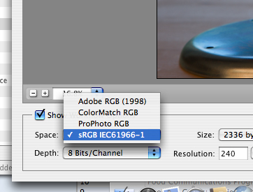
Simply switch this from Adobe RGB to sRGB, and proceed on with the rest of your workflow. Once you’ve set this, you shouldn’t need to change it again. You should also be able to change this setting within Photoshop (or Photoshop Elements).
Windows applications, such as Picasa and Microsoft Digital Image Suite should save in sRGB by default.
This isn’t the only problem with getting accurate digital color, or even the hardest problem… tackling the differences in displays is a huge issue that I can’t quite fathom how someone is going to solve. But, at least this is one that it’s easy to imagine being fixed. If the browser folks started supporting the various standards (Is various standards an oxymoron?) that are available today, it would make a huge difference. You can bet I’ll be pinging my IE friends to make sure that better color support is built into the next versions of IE… if anyone out there knows any Firefox developers, please, plant the seed! Either that, or all you Mac users should switch back to using Safari!
Update: If you want to see if your web browser is color managed, here is a quick tutorial that shows you the differences between properly managed and unmanaged images. If you don’t see a difference, than your browser isn’t showing you everything that should be.
Technorati Tags: Photography, Photoshop, Tips
This was really an eye opener! I use both, Safari and Firefox on my Mac and at first did not realize the fine detail in the colors. Once I read this I went back and compared your pics and then my pics … on your pics I could tell the difference immediately. Mine I had to look twice, but yes there are differences in color in different Browsers.
Thanks L, for the helpful tips here! i do mostly use iPhoto and will certainly be paying more attention to the fine details!
I immediately checked the difference between Firefox (that I use) and Explorer when reading Lucullian but there was no difference-same colour scheme…
Colour space drives me CRAAAAAAAAAZZZZZYYYYYYYYY!!
Ah-hem. My husband got me a printer over a year ago, so I could run off photos at home. From day one, I haven’t been able to get good colour out of it. While I dont’ have gretag/macbeth or any devices, I’ve used the program in my Mac, as well as a couple of calibration devices downloaded from the inernet.
I’ve tried setting up my printing schemes several different ways- none were close to what I was seeing on the screen. I called the printer company; they said it was Mac problem. I called Mac; they said it was an Adobe Photoshop problem. I called Adobe, and they said I needed to get in touch with the printer folk.
I finally took the computer and printer to a local computer company. They kept it for two weeks, couldn’t find any problems with the computer or printer, but still couldn’t explain why the colours were coming out wrong.
I send my digital photos to a lab, and they come out just fine. It’s completely frustrating.
What a fascinating and helpful post. Thank you, L.!
s’kat – forgive me if this is a way obvious question and the answer has already been implied in your comment – but have you tried recalibrating your monitor? Sometimes you can calibrate your monitor to a setting specific to a printer, I think. Nevertheless, it’s always so hard to match up right colors on a printer…
The ironic part for me is that my photos got worse when I moved back to always shooting Raw… my photos from earlier in the year and last year ended up looking better! I really should go back and fix them, but there are so many, I think I won’t this time.
Meeta & Ilva – glad yours are ok!
s’kat – oh, when I get to printing, it’s going to be an even longer post than this. I have friends that are absolute experts in this that still can’t get WYSWIG prints. It’s a terrible problem in the digital industry now. I will print some of my stuff at home, but if it’s anything that I care deeply about, I’ll send it out to the pros. There are just too many variables between the printer profile, the monitor profile, the image profile and the software…
Faith – Thanks! And, you are right that monitor calibration does have something to do with it. Typically, you don’t really want to calibrate your monitor to your printer… but you do want to have them calibrated to the same standard. You often need a flatbed scanner to do this well… basically, you print something that is a known quanity (the color equivalent to a grey card), and then scan it back in. Then, it’s possible to create a profile for the printer that understands what the printer thinks of as red and adjusts the image data sent accordingly. Monitor “spiders” do the same thing… they scan the screen, and interpret the actual color versus intended color. This will definitely be the subject of future posts because there is so much to cover! I think I’ve now made my comments miles long 🙂
-L
Faith, yes, I’m sorry if that wasn’t clear, I was on a bit of a rant, lol. I’ve tried many times to calibrate it, but to no avail. The scanner and the computer, luckily, seem to work in perfect harmony.
And L, by the way, I just love the work you do here! It’s all been very helpful, and you have a great way of breaking things down.
Interesting post, L. Thank you!
I only saw mine in Safari recently as well, such as at Stretch’s studio and I know what you mean about a browser difference for color. But now that you say that, I don’t remember if I saw a major difference. I need to go back and check! Unfortunately, I sometimes forget about that difference between browsers, although I should really having worked for so long in QA! Great post L!
I have worried about this working off my laptop. Not sure how bad it is compared to a full scale monitor. What is fun to think about is that your photographs have always looked fantastic on my Firefox and now I learn that they are even better than I thought. Great post, learned tons!
This cleared up a few geeky questions I have had, and thanks for that! But the bottom line for me has always been trial and error. When I was a recording engineer, I often listened to mixes on a pair of cheap speakers, because you just don’t know what people will use to hear your recording. Even if I could prove mathematically that my mixes were “perfect,” if they don’t sound good to you, they don’t sound good, period.
Likewise with web graphics, I try to check them on different systems and with different software, and try to settle on a happy compromise. Little did I know I was messing with color space.
Thanks again!
Hi L, Great post! One thing you missed however is the DSLR/RAW converter color calibration. Since no two cameras produce the same color output data, now by using a MacBeth Colorchecker chart you’d be able to make sure that whatever you shoot will have accurate color information to start with. Now that still doesn’t guarantee that this color information is represented right on your or someone else computer (you already mentioned color calibration for all other devices).
For extensive photoshop’ing & printing it would certainly make sense to utilize a broader color space, but I see little use for the anyway limited presentation capabilities of a web browser (most readers use unmanaged browsers). So until this will change and with the many quirks and rendering problems Safari has re: CSS compatibility, I can’t afford to take it into consideration.
All the best,
Lucy – Thanks!
jack – 🙂
Larry – Thanks. Yes, that’s a great analogy.
Oliver – Thanks for the tip. You are right that there is an entire color calibration step to ensuring that you get accurate color from start to finish. Maybe at some point I’ll have a whole post on that… but my guess is that it will take many, many posts to get it right. Color calibration is so incredibly tricky… I have lots of friends who spend weeks trying to get their equipment setup to get an exactly perfect print. I’m afraid I don’t have that kind of patience! At this point, I just want to make sure that what I see & think that I’m publishing actually gets viewed as I intended. I know that’s even more than I can hope for at this point, but a girl can dream!
I just checked, and my photos do look much better in Safari than they do in Firefox – more vibrant, richer, and just plain ol’ better. But when I checked in Photoshop, it turned out that I’m using sRGP already – apparently my Canon S400 -> iPhoto -> Photoshop automatically does that. So, I really don’t know what to do about it. Do you know any other tips on how to deal with this?
(By the by, I really love your blogs. The longer I keep at food blogging, the more I get into the photography as well as the food. It’s been really fun and fascinating, the way my interests have expanded through food blogging.)
Hi Danielle,
Thanks! sRGB will give you better results than Adobe RGB… but you are right, there is still a distinct difference. You can change the colorspace to Generic RGB in Photoshop (select Convert to Profile in the Edit menu), but you will lose color depth when do so your photos still won’t have the same richness that you see in Safari. I think what really needs to happen is that we all tell firefox to get their act together and start supporting color profiles!
BTW – I just started a thread on the suggestion forum for Flock (a form of Firefox). Feel free to go and “second” my suggestion.
Hi and thanks for the very interesting piece. For me too, it was an eye-opener. I did my editing in Adobe RGB, and the Firefox version was completely washed out. Now I know why.
All the best, Erik
Your blog is fantastic. I am completely in love with your food photography. You have a very sensual eye for the food. I am even more impressed that this is a second career for you!
I have been reading through many of your posts and tried searching, but I can’t find an answer to my problem: I simply cannot get the color of artichokes to turn out right in my photographs. They either look dull and grey (I think because they have a slight film on the leaves that reflects light??) or the flash catches them and they are neon green. I have tried indoor light, natural sunlight, every sort of light we have at home etc. No dice.
Have you had this problem? Any suggestions? Is it something particular about artichokes or just my relatively simplistic lighting situation?